
Annonse
Why I sometimes wish I were a linguist
First, I need to clarify the following: I am a PhD student in the study program of linguistics. But unlike most other students on that program, my background is not in linguistics. No – I am from the design field, and in my PhD project I look at a selection of current online data visualizations from a designer’s and linguist’s perspective. Being part of this program makes it possible to discuss, think and raise questions about how people in linguistics work and what the differences between them are. In this blogpost you can read a summary of these activities of the last few months.
So, if I am investigating existing data visualizations, what do I need for that? Exactly, I need a collection of such visual material first. When glancing over towards the field of linguistics I realize, almost a bit jealously, that there is a long tradition for carrying out research on systematically collected texts, so called corpora.
Since 1977, a digital archive of English texts has been available (International Computer Archive of Modern and Medieval English - ICAME) (Svartvik, 2007, p. 11), which allows corpus linguists to start their research with an existing corpus.
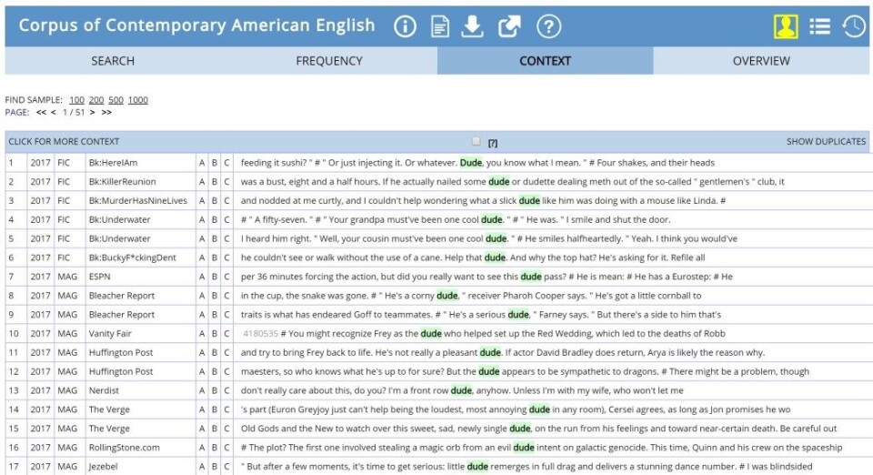
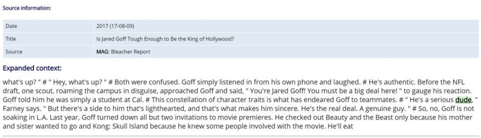
Since then a lot has changed, and huge corpora of different languages have been developed. Just to give you a small glimpse of how big they are: The Corpus of Contemporary American English (COCA) contains more than 560 million words deriving from different kinds of texts. Or even larger is the iWeb corpus, released in May 2018, which contains 14 billion words from 22 million web pages. This is amazing, isn’t it?
Comparing that to the starting point that researchers of visual material – more closely defined as researchers of data visualizations - face, is rather discouraging.
Annonse
To my knowledge, no prebuilt archive of systematically collected data visualizations has existed until now. You might find websites with some links to different data visualizations, award winner lists or collections of examples to various data visualization types, like www.datavizproject.com. These websites all perfectly serve their purposes, but they are not comparable to a corpus of verbal language.
This means that if you are still motivated to go on with your plans, you can either handpick some examples for each single research project, or you build up your own corpus. The big disadvantage with handpicking is, of course, that the evolving sample most probably is not representative of data visualization as a whole. Without going deeper into how to build up a corpus specifically tailored to a single project, I would rather like to talk about some reasons as to why there is no such corpus of data visualizations available.
So, what could be the reasons be? Why is it so hard to develop such a corpus for data visualizations?
Of course, one reason might be that the history of digital data visualizations is relatively short, and therefore the number of people wanting to carry out research into such collections might be smaller than within corpus linguistics. But there are other reasons too:
First of all, the data visualizations knocking around in the depths of the World Wide Web have to be found. And if we want to stay up-to-date, this search needs to become an ongoing action. Some text corpora, like COCA or the iWeb corpus contain a fixed number of texts, without being updated. Others collect new material on a regular basis. Such an example is the Oxford English Corpus - that job is done by a web crawler that constantly searches for new text, according to defined rules. If current developments of data visualizations are to be investigated, such a web crawler and its behavior would have to be developed by somebody first.
When we finally find some visualizations, we need to get hold of them.
The content that is accessed with a certain URL can be changed or made inaccessible by the authors at any time. This makes it necessary to “download” it at some point in time, assign a time stamp to it, and save some metadata such as author names or publishing dates with it. In other words, it’s necessary to become independent from the websites on which these data visualizations were published. By now, at the latest, any of you who have ever produced a data visualization and published it online must be alarmed and asking yourselves: “Is she really speaking of stealing my work, which is actually protected by copyright, simply by using a few automated algorithms?”
I can put your minds at ease: What is done in corpus linguistics is that the text is looked at indirectly, by using “query languages, concordances, parsers and aligners” (Sinclair, 2004, p. 189). To make this possible, the text is specially treated before it can be used by the researchers. To give a few examples: all formatting is deleted, the text is parsed into individual words, it is annotated, and then – and only then - it is made accessible as snippets.
The pertinent question here is, then: Does it make sense to treat data visualizations like this? Is it possible at all?
Certainly, if all formatting and visual characteristics of a data visualization are trimmed to a minimum, there will not be much left. Moreover, dividing data visualizations into word-like elements would be a challenging task, maybe not even possible at all, because a dot in one data visualization might not be used to communicate the same meaning as a dot in another.
Furthermore, the surrounding graphic elements have a significant influence too. Apparently, we might have to think about a solution in which data visualizations can be looked at a bit more directly - or at least where the context and the original visual appearance is preserved. However, for providing that access independently from the websites where they have originally been published, we need more permissions than if we just provide the researchers with the links of these original sources. And the links don’t help too much in this transitory and quickly mutating world of the internet.
Can you see the dilemma?
————-
Read the Norwegian translation of this blog post at forskning.no
Annonse
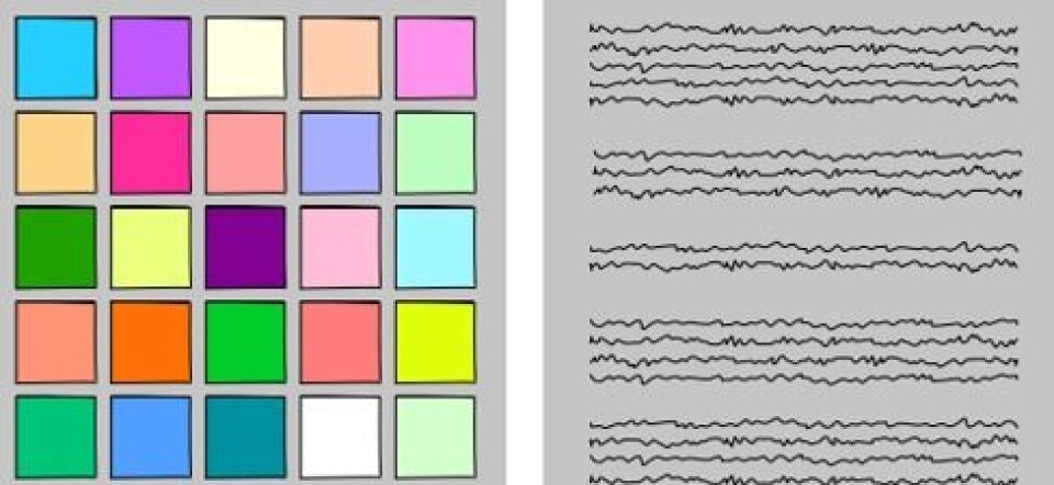
(Image front: © 2019 Verena Elisabeth Lechner)
References:
Davies, M. (2008). The Corpus of Contemporary American English (COCA): 560 million words, 1990-present. Retrieved November 19, 2018, from https://corpus.byu.edu/coca/
Sinclair, J. M. (2004). Trust the Text: Language, Corpus and Discourse. (R. Carter, Ed.). London, UK: Routledge. Retrieved from http://ebookcentral.proquest.com/lib/agder/detail.action?docID=200411
Svartvik, J. (2007). Corpus linguistics 25+ years on. In Corpus linguistics 25 years on (Vol. 62, pp. 9–86). Amsterdam, Netherlands: Rodopi. Retrieved from https://ebookcentral.proquest.com/lib/agder/detail.action?docID=556853